บทความนี้จะนำเสนอการสร้าง Animation ฟองน้ำ ในหน้าเว็บไซต์ และ สร้างปุ่มควบคุมการหยุดและเล่น
เนื่องจากในการทำเว็บที่มีการใส่ Animation สำหรับอุปกรณ์ ที่มีความเร็วก็คงไม่มีปัญหาแต่ถ้าอุปกรณ์ช้าหรืออยากประหยัดพลังงาน คงไม่ดีนักที่จะเปิดเว็บที่มี Animation มากๆ
ซึ่งใน Css จึงได้เพิ่ม prefers-reduced-motion media query เข้ามาเพื่อให้ควบคุมการเล่น Animation ได้
ตัวอย่างเช่นการทำปุ่มปิด หรือเปิด เพื่อให้ User เลือกได้เองเพื่อลดการทำงานของอุปกรณ์
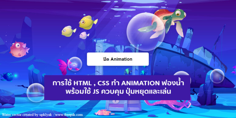
เรามาดูตัวอย่างที่เสร็จแล้ว
1. การสร้างโครง HTML
<!--  html ส่วนฟองน้ำ มีทั้งหมด 10 อัน -->
<div id="background-wrap">
    <div class="bubble x1"></div>
    <div class="bubble x2"></div>
    <div class="bubble x3"></div>
    <div class="bubble x4"></div>
    <div class="bubble x5"></div>
    <div class="bubble x6"></div>
    <div class="bubble x7"></div>
    <div class="bubble x8"></div>
    <div class="bubble x9"></div>
    <div class="bubble x10"></div>
</div>
 <!--  html ส่วนปุ่มที่ควบคุมการหยุดหรือเล่น -->
   <div class="box">
    <button data-toggle >ปิด Animation</button>
    </div>
2. ในส่วน CSS
/* ส่วน Body  */

body {
	background: #00b4ff url(background.jpg) no-repeat center center;
  background-size: cover;
	color: #333;

	height: 100vh;
	margin: 0;
	padding: 0;
	overflow-x: hidden;
}


@media (prefers-reduced-motion: no-preference) {
  body {
    --playState: play;
  }
}

#background-wrap {
    bottom: 0;
	left: 0;
	position: fixed;
	right: 0;
	top: 0;
	z-index: -1;
}


/* ส่วน Animation  */
@-webkit-keyframes animateBubble {
    0% {
        margin-top: 1000px;
    }
    100% {
        margin-top: -100%;
    }
}

@-moz-keyframes animateBubble {
    0% {
        margin-top: 1000px;
    }
    100% {
        margin-top: -100%;
    }
}

@keyframes animateBubble {
    0% {
        margin-top: 1000px;
    }
    100% {
        margin-top: -100%;
    }
}

@-webkit-keyframes sideWays {
    0% {
        margin-left:0px;
    }
    100% {
        margin-left:50px;
    }
}

@-moz-keyframes sideWays {
    0% {
        margin-left:0px;
    }
    100% {
        margin-left:50px;
    }
}

@keyframes sideWays {
    0% {
        margin-left:0px;
    }
    100% {
        margin-left:50px;
    }
}

/* ส่วน Animation แต่ละ Class ทั้ง 10 อัน  */

.x1 {
    -webkit-animation: animateBubble 25s linear infinite, sideWays 2s ease-in-out infinite alternate;
	-moz-animation: animateBubble 25s linear infinite, sideWays 2s ease-in-out infinite alternate;
	animation: animateBubble 25s linear infinite, sideWays 2s ease-in-out infinite alternate;

	left: -5%;
	top: 5%;

	-webkit-transform: scale(0.6);
	-moz-transform: scale(0.6);
	transform: scale(0.6);
}

.x2 {
    -webkit-animation: animateBubble 20s linear infinite, sideWays 4s ease-in-out infinite alternate;
	-moz-animation: animateBubble 20s linear infinite, sideWays 4s ease-in-out infinite alternate;
	animation: animateBubble 20s linear infinite, sideWays 4s ease-in-out infinite alternate;

	left: 5%;
	top: 80%;

	-webkit-transform: scale(0.4);
	-moz-transform: scale(0.4);
	transform: scale(0.4);
}

.x3 {
    -webkit-animation: animateBubble 28s linear infinite, sideWays 2s ease-in-out infinite alternate;
	-moz-animation: animateBubble 28s linear infinite, sideWays 2s ease-in-out infinite alternate;
	animation: animateBubble 28s linear infinite, sideWays 2s ease-in-out infinite alternate;

	left: 10%;
	top: 40%;

	-webkit-transform: scale(0.7);
	-moz-transform: scale(0.7);
	transform: scale(0.7);
}

.x4 {
    -webkit-animation: animateBubble 22s linear infinite, sideWays 3s ease-in-out infinite alternate;
	-moz-animation: animateBubble 22s linear infinite, sideWays 3s ease-in-out infinite alternate;
	animation: animateBubble 22s linear infinite, sideWays 3s ease-in-out infinite alternate;

	left: 20%;
	top: 0;

	-webkit-transform: scale(0.3);
	-moz-transform: scale(0.3);
	transform: scale(0.3);
}

.x5 {
    -webkit-animation: animateBubble 29s linear infinite, sideWays 4s ease-in-out infinite alternate;
	-moz-animation: animateBubble 29s linear infinite, sideWays 4s ease-in-out infinite alternate;
	animation: animateBubble 29s linear infinite, sideWays 4s ease-in-out infinite alternate;

	left: 30%;
	top: 50%;

	-webkit-transform: scale(0.5);
	-moz-transform: scale(0.5);
	transform: scale(0.5);
}

.x6 {
    -webkit-animation: animateBubble 21s linear infinite, sideWays 2s ease-in-out infinite alternate;
	-moz-animation: animateBubble 21s linear infinite, sideWays 2s ease-in-out infinite alternate;
	animation: animateBubble 21s linear infinite, sideWays 2s ease-in-out infinite alternate;

	left: 50%;
	top: 0;

	-webkit-transform: scale(0.8);
	-moz-transform: scale(0.8);
	transform: scale(0.8);
}

.x7 {
    -webkit-animation: animateBubble 20s linear infinite, sideWays 2s ease-in-out infinite alternate;
	-moz-animation: animateBubble 20s linear infinite, sideWays 2s ease-in-out infinite alternate;
	animation: animateBubble 20s linear infinite, sideWays 2s ease-in-out infinite alternate;

	left: 65%;
	top: 70%;

	-webkit-transform: scale(0.4);
	-moz-transform: scale(0.4);
	transform: scale(0.4);
}

.x8 {
    -webkit-animation: animateBubble 22s linear infinite, sideWays 3s ease-in-out infinite alternate;
	-moz-animation: animateBubble 22s linear infinite, sideWays 3s ease-in-out infinite alternate;
	animation: animateBubble 22s linear infinite, sideWays 3s ease-in-out infinite alternate;

	left: 80%;
	top: 10%;

	-webkit-transform: scale(0.3);
	-moz-transform: scale(0.3);
	transform: scale(0.3);
}

.x9 {
    -webkit-animation: animateBubble 29s linear infinite, sideWays 4s ease-in-out infinite alternate;
	-moz-animation: animateBubble 29s linear infinite, sideWays 4s ease-in-out infinite alternate;
	animation: animateBubble 29s linear infinite, sideWays 4s ease-in-out infinite alternate;

	left: 90%;
	top: 50%;

	-webkit-transform: scale(0.6);
	-moz-transform: scale(0.6);
	transform: scale(0.6);
}

.x10 {
    -webkit-animation: animateBubble 26s linear infinite, sideWays 2s ease-in-out infinite alternate;
	-moz-animation: animateBubble 26s linear infinite, sideWays 2s ease-in-out infinite alternate;
	animation: animateBubble 26s linear infinite, sideWays 2s ease-in-out infinite alternate;

	left: 80%;
	top: 80%;

	-webkit-transform: scale(0.3);
	-moz-transform: scale(0.3);
	transform: scale(0.3);
}


/* ส่วน ฟองน้ำหลัก  */
.bubble {
    -webkit-border-radius: 50%;
	-moz-border-radius: 50%;
	border-radius: 50%;

    -webkit-box-shadow: 0 20px 30px rgba(0, 0, 0, 0.2), inset 0px 10px 30px 5px rgba(255, 255, 255, 1);
	-moz-box-shadow: 0 20px 30px rgba(0, 0, 0, 0.2), inset 0px 10px 30px 5px rgba(255, 255, 255, 1);
	box-shadow: 0 20px 30px rgba(0, 0, 0, 0.2), inset 0px 10px 30px 5px rgba(255, 255, 255, 1);

    height: 200px;
	position: absolute;
	width: 200px;
  animation-play-state: var(--playState, paused);
}

.bubble:after {
    background: -moz-radial-gradient(center, ellipse cover,  rgba(255,255,255,0.5) 0%, rgba(255,255,255,0) 70%); /* FF3.6+ */
    background: -webkit-gradient(radial, center center, 0px, center center, 100%, color-stop(0%,rgba(255,255,255,0.5)), color-stop(70%,rgba(255,255,255,0))); /* Chrome,Safari4+ */
    background: -webkit-radial-gradient(center, ellipse cover,  rgba(255,255,255,0.5) 0%,rgba(255,255,255,0) 70%); /* Chrome10+,Safari5.1+ */
    background: -o-radial-gradient(center, ellipse cover,  rgba(255,255,255,0.5) 0%,rgba(255,255,255,0) 70%); /* Opera 12+ */
    background: -ms-radial-gradient(center, ellipse cover,  rgba(255,255,255,0.5) 0%,rgba(255,255,255,0) 70%); /* IE10+ */
    background: radial-gradient(ellipse at center,  rgba(255,255,255,0.5) 0%,rgba(255,255,255,0) 70%); /* W3C */
    filter: progid:DXImageTransform.Microsoft.gradient( startColorstr='#80ffffff', endColorstr='#00ffffff',GradientType=1 ); /* IE6-9 fallback on horizontal gradient */

	-webkit-border-radius: 50%;
	-moz-border-radius: 50%;
	border-radius: 50%;

    -webkit-box-shadow: inset 0 20px 30px rgba(255, 255, 255, 0.3);
	-moz-box-shadow: inset 0 20px 30px rgba(255, 255, 255, 0.3);
	box-shadow: inset 0 20px 30px rgba(255, 255, 255, 0.3);

	content: "";
    height: 180px;
	left: 10px;
	position: absolute;
	width: 180px;


}
3. js ในการควบคุม Animation
// Query ปุ่มมาเก็บไว้ในตัวแปร
const toggle = document.querySelector('[data-toggle]');


// ตัวแปรสำหรับ เช็ค ปิดหรือเปิด
let shouldPauseAnimation = false


// ใส่ Event ให้กับปุ่ม
toggle.addEventListener('click', () => {
  shouldPauseAnimation = !shouldPauseAnimation


  if (shouldPauseAnimation) {
    // ถ้าค่าการปิด
    toggle.innerText = 'เปิด Animation'
  document.body.style.setProperty('--playState', 'paused')
  } else {
    // ถ้าค่าการเปิด
    toggle.innerText = 'ปิด Animation'
    document.body.style.setProperty('--playState', 'running')
  }
})